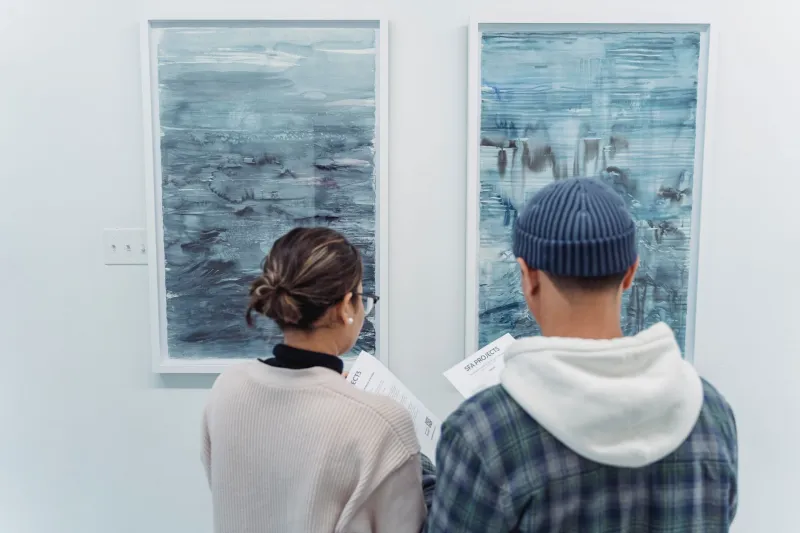
Breathing Room: The Quiet Power of Emptiness in Modern Design
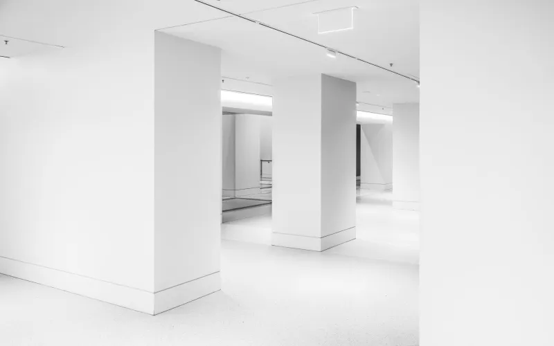
There's a moment — you've probably felt it — when you walk into a room and something just settles in your chest. The furniture isn't crowded. The walls aren't plastered. There's air between things. You exhale without realizing you'd been holding your breath.
That feeling has a name in design circles: negative space. And while it sounds like an absence, it's actually one of the most deliberate, intentional acts a designer can perform.
When Nothing Becomes Something
Negative space — the empty area surrounding or between subjects in a composition — is as old as art itself. Japanese ink wash paintings from the 12th century left vast stretches of white silk untouched, letting the painted branch or mountain exist in conversation with open sky. The Zen concept of ma, roughly translated as "the pause" or "the interval," informed everything from architecture to music to the arrangement of a meal on a plate.
But in the American design context, the embrace of intentional emptiness feels newly urgent. We are, by most cultural metrics, a nation drowning in stimulation. Our phones buzz with notifications before we've finished our morning coffee. Billboards stack on top of billboards. Social media feeds are engineered to have no natural stopping point. In this climate, a design that chooses restraint isn't just aesthetically pleasing — it's almost radical.
Los Angeles-based graphic designer Maya Okonkwo describes her relationship with negative space as almost confrontational. "When I first started out, clients would look at my work and say, 'But there's so much white — did you forget to add something?'" she laughs. "Now those same clients are asking for more breathing room. People are starting to understand that the empty parts are doing real work."
The Psychology Behind the Pause
What's actually happening when we respond to negative space? Cognitive psychologists point to something called perceptual grouping — the brain's tendency to find relationships between objects based on their proximity and surrounding context. When a designer leaves generous space around an element, the eye is guided, not overwhelmed. Attention becomes focused rather than scattered.
But there's something deeper going on, too. Psychiatrists who study sensory overload note that visual clutter activates stress responses in the brain similar to physical crowding. When we encounter design that breathes, we relax. The nervous system interprets open space as safety.
This might explain why so many Americans have developed what feels like a cultural hunger for minimalism — not just as a trend, but as a kind of emotional necessity. The aesthetic success of brands like Apple, Muji, and Aesop isn't accidental. Their design language essentially says: we will not overwhelm you. And that promise, in this moment, feels like a gift.
The Void as Medium
For some artists, empty space isn't a supporting player — it's the whole point.
Sculptor and installation artist Dara Elkins, whose work has appeared in galleries from Chicago to Portland, builds environments where the relationship between object and open air is the subject of the piece. Her 2023 installation Interval at a Brooklyn warehouse featured seventeen thin steel rods suspended from the ceiling, each one spaced precisely four feet apart. Visitors walked through them, their bodies becoming part of the composition.
"People kept asking me what the rods meant," Elkins recalls. "But the rods weren't the work. The space between them was the work. I wanted people to feel the gaps, to move through emptiness and realize it has texture."
This idea — that empty space has texture, that it can be felt — is central to how contemporary artists are pushing the conversation forward. The void is no longer simply the background. It's a medium in its own right, as expressive as oil paint or clay.
Everyday Objects, Extraordinary Restraint
You don't have to visit a gallery to encounter this philosophy. It's showing up in product design, in packaging, in the quiet revolution happening on kitchen countertops across the country.
The rise of what some designers call "considered objects" — items designed with deliberate simplicity, where every line earns its place — reflects a broader shift in consumer values. People are increasingly drawn to things that don't demand attention, that sit quietly in a room without performing. A ceramic mug with a single, subtle curve. A lamp whose shade disappears into the wall behind it. A book cover that is mostly white space, the title barely a whisper in the corner.
Seattle-based product designer Tomás Reyes has built his entire practice around this principle. "I ask myself one question with every object: what can I remove?" he says. "Not what can I add to make it more interesting — what can I take away until only the essential remains? That's where the beauty lives."
The Cultural Permission We're Finally Giving Ourselves
There's something worth sitting with here: the fact that Americans are increasingly receptive to design that asks less of them might say something profound about where we are culturally. After decades of more-is-more consumer culture, there's a growing desire for experiences — including visual ones — that don't extract. That give instead of demand.
Negative space, at its best, is an act of generosity. It trusts the viewer to bring something of themselves to the empty area. It resists the urge to explain, to fill, to over-clarify. It says: here is room for you.
In a media landscape built on capturing and holding attention at any cost, a design that willingly releases your gaze — that creates space for your own thoughts to wander in — feels quietly subversive.
The Whisper That Carries
At Rivernana, we're drawn to the idea that the most powerful creative gestures are often the softest ones. The river doesn't roar to prove it's moving. It carves canyons over centuries, patiently, without announcement.
Negative space works the same way. It doesn't compete for your attention — it earns it, slowly, by offering what almost nothing else in your day does: room to breathe.
So the next time you find yourself drawn to something and can't quite articulate why — a logo, a room, a painting — look at what isn't there. Chances are, that's exactly what's speaking to you.